Mara Lindqvist

03:56 in Lisbon

Typeface

Nord Sans

•

2024

A grotesk for long reading

A grotesk for long reading

Nord Sans is a six-weight grotesk drawn for long reading on screens — open apertures, generous spacing and a slightly warmer rhythm than its Swiss cousins.

Nord Sans is a six-weight grotesk drawn for long reading on screens — open apertures, generous spacing and a slightly warmer rhythm than its Swiss cousins.

Client

Nord Sans

Year

2024

Role

Type designer

Duration

2 years

Services

Type design, Specimen, Posters

Wall of Nord Sans letter specimens above a desk with printed proofs

The challenge

Most grotesks are drawn for headlines and look cold at body sizes. I wanted one family that works from a 9px caption to a 300px poster.

The approach

Two years of drawing, testing in real products and printing specimens. Every glyph was checked at 12px on a phone before it was checked at poster size.
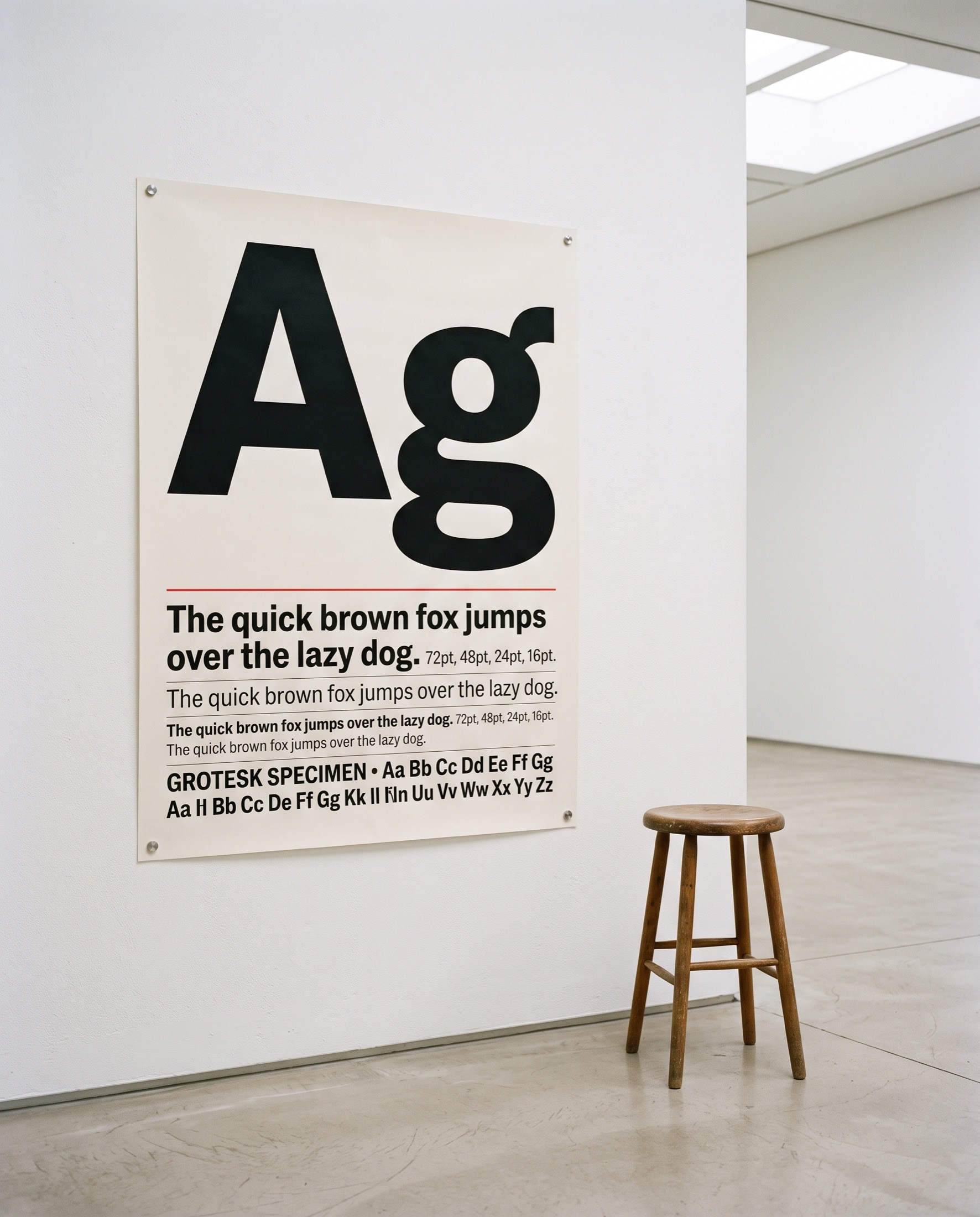
Nord Sans poster with large Ag glyphs on a white gallery wall beside a stool
Framed Nord Sans posters showing the glyphs R, a and & in a bright gallery

Results

6

weights + italics

640

glyphs per style

TDC

Certificate 2024

Open Nord Sans type specimen booklet with a pencil and a metal ruler

“

Calm, legible, and quietly opinionated.

Calm, legible, and quietly opinionated.

Type Directors Club jury

More work

All work

Mara Lindqvist

Product & brand designer in Lisbon. Calm products and honest brands since 2017.

Contact

Create a free website with Framer, the website builder loved by startups, designers and agencies.